Resilient Relay Applications
This is a guest post written by Ernie Turner, a Staff Engineer at Coinbase. Coinbase has thoroughly adopted Relay in their applications and is a strong ally of the Relay Team. Last year they helped co-develop the Relay VSCode extension. Ernie has agreed to share this internal engineering blog post with us.
How to provide the best experience for customers during service disruptions
In a perfect world, none of the services at Coinbase would suffer outages, and all fields in our GraphQL schema would resolve correctly all the time. As this isn't practical, Coinbase applications should be resilient to downtime and minimize the impact on customers: a single service suffering downtime should not prevent users from using or interacting with an entire app. However, it's also important that we convey issues to users when our applications aren't working as expected. Showing error messages that convey downtime with retry buttons is a better experience than confusing users with missing content or UI they can't interact with.
This post will cover the common patterns and best practices for dealing with missing data in a Relay application.
Screen Architecture and Error Boundaries
Before we discuss handling service downtime and failures in GraphQL queries, let's first discuss broader screen architecture and how React Error Boundaries can help create a better user experience when used correctly.
Like most things in life, Error Boundaries should be used in moderation. Let's look at a common screen in the Coinbase Retail app.
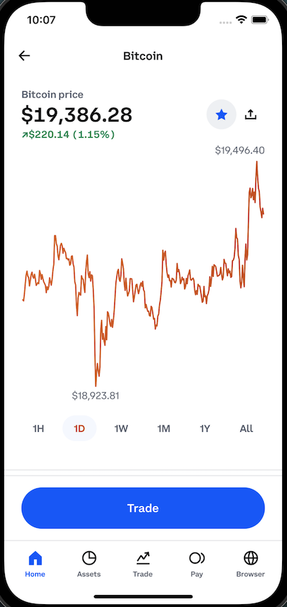
Any section in the above screen could fail to get the data required to render, but it's how we approach these failures that differentiates what experience a user has with our app. For example, only using a single screen-level ErrorBoundary for any failure causes the app to be unusable when any error occurs, regardless of the significance of that error. In contrast, wrapping each component in its own ErrorBoundary can create just as bad of an experience. Lastly, omitting components with errors entirely is as bad as the other two options. There is no one-size-fits-all approach, so let's break down each of these and explain why they create poor user experiences.
Full Screen Error
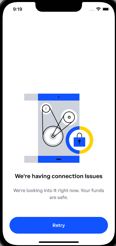
The UI above is Coinbase's full-screen error fallback that is displayed if a service is experiencing disruptions and we couldn't get the data necessary to render the components on this screen. In certain situations, this actually creates a good user experience. We may not be giving the user detailed information as to what happened, but in most situations providing the technical cause is not possible, nor would it improve the users' experience. However, we are telling them something isn't working correctly and giving them a clear Retry button to attempt to get the app working again.
If the reason we're showing this to the user is because we can't load something non-critical, like the asset price history graph or their watchlist status, we shouldn't take down the entire screen. Hiding the current price of bitcoin and preventing the user from trading, just because we can't tell them whether bitcoin is on their watchlist, is a negative user experience.
Another negative of this UI is that it hides all app navigation from the user. Even if we have a good reason to show the user a full screen error, that doesn't mean we should hide the rest of the app in the process. A user should still be able to navigate to a different screen. In practice, we should only show users a “full screen error” and not a “full app error”.
Error Messages Everywhere
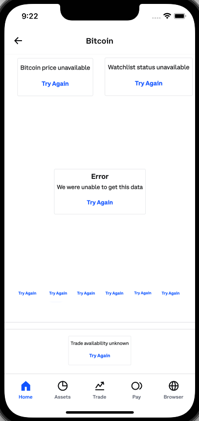
The UI pictured above is, in many ways, worse. This is the opposite end of the previous experience and showing the user a full-screen error would be preferable. Error messages for the price history graph make sense, because the user would expect that UI to be on this screen, but if the user can't even see the price of bitcoin or find the Trade button, we really ought to show them the UI in the first screenshot (but with navigation) - as the core goal and purpose of this screen has been lost.
This image also demonstrates how ErrorBoundaries can be too prevalent. The entire price history graph with the time range selectors should only have a single error message, not one per time range.
Empty Fallbacks
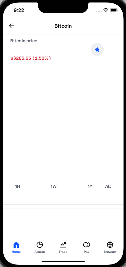
The UI above is just as bad as the example prior. In this case, our ErrorBoundaries fall back to empty content. For certain UI elements, this makes sense. The missing Share button next to the watchlist isn't critical for this UI, so omitting it makes sense. However, hiding the current price of bitcoin, the price history graph, and the Trade button makes the UI unusable and even somewhat misleading. Even users who don't use the app every day would know that something is off. We also aren't giving the user any option to retry any failures —the user just sees empty content with no way to recover.
What should the user see instead?
The following two screenshots show an example of a better experience for the user. The first screenshot is what the user should see if we can't get the current price of bitcoin or if we can't determine whether the user is allowed to trade. The second screenshot would be a better experience for a user if we couldn't get the current change in the price of bitcoin or the price history.
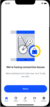
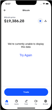
All of this points to a need to classify sections of the UI on a screen: what is critical for the user's experience, what UI the user expects to see, and what supporting content is optional to the experience.
Critical vs Expected vs Optional UI
Not all UI elements in an application screen are the same. Some portions of the UI are critical to the core purpose of the screen, others might just be more informational and helpful to users. For application design at Coinbase, we group UI elements into three categories, Critical, Expected, and Optional.
Critical UI Elements
The parts of a screen that define the core information or interaction a user has with the UI. Without these elements in the UI, the screen does not make sense, and if they were missing, users would be confused and/or angry, as it isn't clear why the app wasn't working as expected.
Suppose we can't load the data necessary to display these critical UI elements. In that case, we should show the user a full-screen error message explaining the problem (if possible) with a retry button that lets them easily attempt to re-request the missing data.
Letting users interact with an application that is missing critical UI elements will cause confusion, anger, and even possible loss of funds if the user is able to complete a transaction without knowing the full details of what is happening.
Examples of Critical UI elements:
- The user's current portfolio balance on the Coinbase app home screen
- The Asset Price, Payment Method, and total Purchase Price on the order preview screen
- The user's lifetime earnings and earnings per asset on the Earn screen
Expected UI Elements
Expected UI elements are the parts of a screen that might not serve the core purpose of a screen, but that most users would expect to be present. If Expected UI elements are missing from a screen, the user is likely to think that something is wrong, but this wouldn't prevent them from performing the core actions of the screen.
If we can't load the data necessary to display these expected UI elements, we should show the user a component-local error message telling them that there is an expected UI that is missing. These error messages should also be accompanied by a retry button to let the user re-request the missing data. Localized errors have a higher chance of not being seen or interacted with by the user, which is somewhat acceptable since they aren't required for the core purpose of the screen.
Letting users interact with an application that is missing expected UI elements should be acceptable but it might cause confusion about what is happening. Completely omitting these UI elements without an accompanying error message would create a worse experience.
Examples of Expected UI elements:
- An asset's current price on the Buy Asset screen (where they enter the amount to buy)
- The price history graph on an asset detail screen
- A list of recent transactions on the Coinbase Card screen
Optional UI Elements
Optional UI elements are the parts of a screen that are purely supportive to the main purpose of a screen. Some users might notice these missing elements, but others might be completely unaware that they're supposed to be present at all. In either scenario, a user wouldn't be prevented from accomplishing their main goal on the screen.
If we can't load the data necessary to display these Optional UI elements, we should instead just omit them entirely from the UI. However, this comes with the following risks:
A. The user might not know that anything is missing B. There won't be a way for the user to re-request the data for this UI unless they do a full screen refresh.
Developers should consider these downsides and ensure that they do not cause a negative user experience. Instead, these failures should be logged so that product engineers are notified when the user experience is less than ideal.
Examples of Optional UI Elements:
- Offer cards on the asset detail screen
- Asset category sections on the Trade screen (New on Coinbase, Top Movers, etc.)
- News feed on the Home Screen
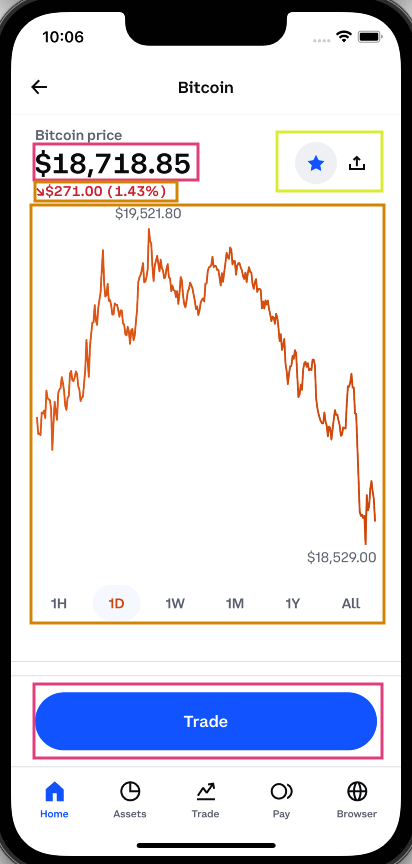
Let's return to the image above and classify the sections of the UI into these categories.
Element Classification Limits
In the example above, we have a screen that has two critical components, two expected components, and one optional component. Most screens in an app should only have a handful of critical UI components on them. For some screens, the entire UI might be composed of one single critical component.
The same is true for expected elements. If we have a screen that's composed of five separate expected UI elements, we'd end up with the screenshot above with ‘Try Again' buttons littered across the app. Limit the number of expected elements and retry buttons on a single screen to only one or two if possible.
Pull To Refresh
For all of the above scenarios, users on mobile apps should be able to pull-to-refresh to retry any failed request on a screen. With Relay applications, this will usually mean retrying the full screen-level query. If a screen has any error messages or hidden components because of missing data, using pull-to-refresh should always attempt to fix all of those error conditions.
Work with your Product Managers and Designers
All of this classification is subjective — and all of the examples above are just one opinion and a designer or PM may have different opinions on how screens should degrade. It is important for cross-functional alignment when designing application UI. Teams should consult engineers, designers, and product managers to ensure seamless and on-brand screens across your entire app.
How Relay Can Help
Once you've classified your screen into sections, the next step is to add the proper ErrorBoundaries to your app and configure your components' GraphQL fragments depending on their classification. This is where Relay can help. Based on our experience working with Relay apps, we've created several best practices around how to deal with missing data from GraphQL queries.
Background
Our goal at Coinbase is to work with a nullable schema as recommended by the Relay team. The primary driver is that it puts the decision on how to handle service outages and missing query data in the hands of the client engineer. Without a nullable schema, the decision of what to do with missing data is made on the server (by bubbling up null values to the nearest nullable parent), and the client code has no recourse to change this decision.
This decision is buoyed by the existence of the Relay @required directive, which allows client engineers to annotate their queries and fragments with directives that tell Relay how to handle missing data at runtime. This reduces boilerplate code that engineers would be required to write otherwise. On the surface, the directive seems very simple: it only comes with three options which are all pretty straightforward. However, when attempting to use this directive for various use cases, it becomes clear that the choice of which option to pick is not always obvious, nor is the decision of whether to use the directive at all.
Locality of @required
One great feature of the @required directive is that it only affects the fragment in which you use it. It will never change the behavior of other fragments that query the same field. This allows you to add or remove the directive without thinking about anything outside your component's scope. This is important because different components may be categorized differently, even if they get data from the same query. Being able to mark fields in fragments of the same query with different @required arguments is important to help build ideal user experiences.
Using action: LOG vs action: NONE
The LOG and NONE actions both have the same runtime behavior, but LOG will send a message to your logging mechanism of choice, logging the full path to the field that was returned as null. For most use cases where the @required directive is needed, LOG should be used over NONE. The only time NONE should be preferred is if a field is expected to be null for some users.
While the log entry created by using action: LOG isn't likely to be actionable on its own, however, it can be a useful signal as a breadcrumb for future errors. Being able to look at the history of an error and see that a specific field was unexpectedly null can help track down future errors the user might encounter in a workflow.
When to use @required(action:LOG/NONE)
The LOG/NONE actions should only be used on fields which are necessary to display Optional UI in your components. There are two distinct use cases that this shows up when designing your application
- Your component is Optional UI and shouldn't be rendered at all if a field or set of fields is null
- A portion of your component is Optional UI and relies on an object type field where that object makes no sense without one or more of its child fields
Let's look at a fragment that encompasses both of these use cases:
fragment MyFragment on Asset {
  id
  name @required(action: LOG)
  slug @required(action: LOG)
  color
  supply {
    total @required(action: LOG)
    circulating @required(action: LOG)
  }
}
For this fragment, we're saying that the entire fragment is invalid if we don't get the name or slug fields. If those fields are returned from the server as null, we can't render this component at all. This fragment also shows how to use the @required(action: LOG/NONE) directive to invalidate an entire object type field. This fragment says that if we don't have either of the supply.total or supply.circulating fields, then the entire supply object is itself invalid and should be null. This nullability will then be used to hide an optional portion of this component's UI.
Now let's see how our component will handle the results from this query:
const asset = useFragment(
  graphql`
    fragment MyFragment on Asset {
      id
      name @required(action: LOG)
      slug @required(action: LOG)
      color
      supply {
        total @required(action: LOG)
        circulating @required(action: LOG)
      }
    }
  `,
  assetRef,
);

// If we couldn't get the required asset name or slug fields, hide this entire UI
if (asset === null) {
  return null;
}
// Otherwise hide certain portions of the UI if data is missing
return (
  <>
    <Title color={asset.color}>{asset.name}</Title>
    <Subtitle>{asset.slug}</Subtitle>
    {asset.supply && (
      <SupplyStats total={asset.supply.total} circulating={asset.supply.circulating} />
    )}
  </>
);
The @required directive really shines here because it removes complex null checks that we'd have to write otherwise. Instead of having to check whether both the asset.name or asset.slug fields are null, we can simply check if our entire fragment was nulled out and prevent rendering. The same is true when checking whether we should render the SupplyStats component. We only have to check whether the parent field is null in order to know that the two subfields are non-null.
When to use @required(action:THROW)
Using @required(action: THROW) is more straightforward. This action should be used on fields that are necessary to render your Expected or Critical UI component. If these fields are returned as null from the server, your component should throw an error to the nearest ErrorBoundary and the user should see an error message.
How far up the tree your ErrorBoundary is depends on how much of the UI you want to remove if there's an error. For example, if we're showing the user an error instead of an asset price history graph, it doesn't make sense to keep the time series buttons still in view, that entire UI should disappear as well. But we don't want to take out the entire screen if this happens either.
Make sure your ErrorBoundary provides a mechanism for the user to retry the failed query to see if they can get the data on a subsequent attempt. We should always pair an error message with an actionable element to let the user recover. We shouldn't rely on the user being able (or knowing) to use the pull-to-refresh to reload the screen.
A note about using @required(action: THROW) on fields in arrays
You should almost never use the THROW action in a component that selects both an array field and fields of that array. As an example of what not to do:
function Component({ assetPriceRef }) {
  const { quotes } = useFragment(
    graphql`
      fragment ComponentFragment on AssetPriceData {
        quotes {
          # Returns an array of items
          timestamp
          price @required(action: THROW)
        }
      }
    `,
    assetPriceRef,
  );
}
This component selects both the quotes array along with the timestamp and price fields on every item in that array. Putting THROW on the quotes field would be acceptable if we want to show the user an error if we don't get back any quotes. But, putting THROW on the price field would result in showing the user an error if even a single price field in that array was null. That's probably not the behavior we want. If we got back 23 of the 24 quotes for the past day correctly, we should probably still display the results we have and just omit the empty values instead.
Instead, we should use action: LOG/NONE so that we only invalidate a single item in the array instead of all items. We can then optionally filter out the null values in the array if needed.
function Component({ assetPriceRef }) {
  const { quotes } = useFragment(
    graphql`
      fragment ComponentFragment on AssetPriceData {
        quotes {
          # Returns an array of items
          timestamp
          price @required(action: LOG)
        }
      }
    `,
    assetPriceRef,
  );
  const validQuotes = quotes.filter(removeNull);
}
When NOT to use @required on a field
The unhelpful answer to this question would be “don't use @required when a field isn't required”. That answer trivializes the decision of what is required and what isn't when the answer is usually more nuanced, especially when your fragment has a dozen fields or more. However, we can follow a number of best practices to decide whether to mark a field as required or not. Again, it is important that you work with your PMs and Designers to help you with these decisions.
There is also a fine line between when to omit the @required directive vs using it with the LOG/NONE action. The primary difference is that you should omit the @required directive when the UI rendered by that field is Optional UI.
Some components in your application can render a combination of different classifications of UI. For example, a single component might be responsible for displaying both the current price of an asset as well as what percent of users have bought or sold the asset over some time frame. This means the component is mixing both Critical UI (asset price) and Optional UI (buy/sell stats).
If a field is used to render optional content which can instead be omitted from the UI entirely without causing confusion for the user (remember, that's the definition of Optional UI) then you shouldn't use the @required directive on that field. Instead, you should add checks to your code to omit the UI if the field is null.
function SomeComponent({ queryRef }) {
  const { asset } = useFragment(
    graphql`
   asset {
     latestQuote @required(action: THROW) # Required data
     buyPercent  # Optional data
   }`,
    queryRef,
  );

  return (
    <div>
      <div>Price: {asset.latestQuote}</div>
      {asset.buyPercent !== null && (
        <>
          <div>Buy Percent: {asset.buyPercent}</div>
          <div>Sell Percent: {1 - asset.buyPercent}</div>
        </>
      )}
    </div>
  );
}
In this example it would be incorrect to use @required(action: LOG/NONE) on the buyPercent field because that would invalidate the entire fragment which isn't the behavior we want.
Another less common use case of when to omit the @required directive is when you can provide a safe fallback value. Providing a fallback/default value for a field can be very dangerous if done incorrectly. While there are a few cases where it's potentially safe to fall back to a default value, it's generally pretty rare and should be avoided. However, if you can provide a safe fallback value, you should avoid adding @required to that field and instead use a fallback value.
A couple of guidelines of when to provide a fallback value:
- Fallback values for numeric fields (numbers or strings that represent numbers) should not be used.
- Using a 0 in place of a missing value will always create more confusion for the user. Coinbase is a financial company and if we can't display accurate values to users, we shouldn't be displaying them at all. Showing a user that their account balance is $0.00 is clearly much worse than showing them an error message. That's an obvious use case, but even places such as the price change percent for an asset, APY% for Coinbase Card, or the amount a user can make via Coinbase Earn should never show 0 if we don't have the actual value.
- Fallback values for boolean fields should be used with caution.
- The first choice for a fallback for boolean fields is usually to set the field to false. Depending on what the boolean field represents, falling back to false can create a worse customer experience than showing the user an error. Falling back to false for a field like
isEligibleForOfferis probably acceptable because that is likely showing Optional content. Falling back to false for a field likehasCoinbaseOneSubscriptionwould not be acceptable because for a user who is a CoinbaseOne subscriber the content is Expected and the user is going to be confused about why that UI is missing in the app
- The first choice for a fallback for boolean fields is usually to set the field to false. Depending on what the boolean field represents, falling back to false can create a worse customer experience than showing the user an error. Falling back to false for a field like
- Falling back to an empty array for array fields should be used with caution.
- If you're showing the user their list of Coinbase Card transactions, falling back to an empty array is a bad idea, but if you're showing the user a list of recently added assets, it's probably okay to fallback to an empty array to omit the UI from displaying since the component is already going to have to deal with the case of the array being empty.
- String fields should usually just deal with null instead.
- In some cases, you might want to fallback to an empty string for string fields that are returned as null, but usually this creates the same code path if you just leave the field as null. Most string fields in a schema aren't expected to be empty so falling back to an empty string can create negative user experiences where the user will be shown an empty string instead of actual content.
function SomeComponent({ queryRef }) {
  const asset = useFragment(
    graphql`
      fragment MyFragment on Asset {
        canTrade @required(action: THROW) # Required data
        hasOfferToStake # Optional data
      }
    `,
    assetRef,
  );

  const showStakeOffer = asset.hasOfferToStake ?? false;

  return (
    <div>
      {asset.canTrade && <Button>Trade</Button>}
      {showStakeOffer && <Button>Stake your currency</Button>}
    </div>
  );
}
Summary
If you've taken anything away from this document, hopefully, it's that a lot of thought needs to go into how to handle downtime and service interruptions. Handling failure states is an important part of building world-class applications. Make sure your design and PM team are on the same page with your team when scoping out new features. If they don't give you advice on what to show the user when data is missing, push back to come to a consensus as a team on these decisions.
Relay can be a powerful tool in helping deal with application failures. Its granular ability to help you decide how to deal with failure might involve more work than you're used to. However, this extra effort pays off in the long run and goes a long way to improving customer experience with your applications.